 Script Planner Assistant▸
 AI Apps
 AI News

HeroUI: Beautiful, Fast & Modern React UI Library Based on Tailwind CSS
HeroUI: Beautiful, Fast & Modern React UI Library Based on Tailwind CSSIntroduction
What is HeroUI?
HeroUI (formerly NextUI) is a beautiful, fast, and modern React UI library built on Tailwind CSS. It supports theme customization, automatic light/dark mode switching, and delivers high accessibility based on React Aria. It offers a type-safe development experience and a multi-package architecture, includes a Pro version with 210+ prebuilt components, and is compatible with the new Next.js directory structure.
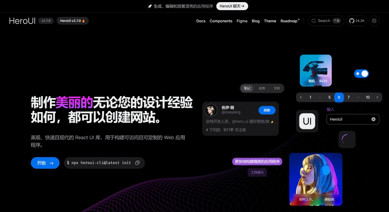
Key Features of HeroUI
Built on Tailwind CSS: Uses Tailwind CSS as its styling engine with no runtime styles, avoiding unnecessary classes in your bundle.
Automatic Dark Mode Detection: Automatically detects changes to the HTML theme attribute and switches themes accordingly.
Fully Typed: Offers a fully typed API, minimizing the learning curve and helping developers get up to speed quickly.
Decoupled Components: Components are split into multiple packages, so you can install only what you need.
WAI-ARIA Compliant: Components follow WAI-ARIA guidelines, providing keyboard support and sensible focus management.
Rich Prebuilt Templates: Offers over 210+ beautiful, responsive components.
Core Capabilities of HeroUI
Theming System
Provides a Tailwind CSS plugin that supports modifying the semantic tokens of the default theme (such as colors and backgrounds) or creating entirely new themes. Sample code demonstrates the primary color configuration for different themes (e.g., primary: "#0072f5").
Supports automatic light/dark mode switching by detecting the dark attribute on the HTML element. Simply add the attribute to the root tag to enable the default dark theme.
Performance
Built on Tailwind CSS with no runtime styles. Unused classes are purged during bundling, ensuring a lightweight and fast experience.
Fully typed API (TypeScript support), lowering the learning curve and supporting React Server Components (components include the "use client" directive and can be used directly in RSC).
Multi-package architecture allows developers to install components on demand, reducing redundant dependencies.
Accessibility
Built on React Aria and compliant with WAI-ARIA standards. Includes built-in keyboard navigation, focus management, and screen reader support. The focus ring only appears during keyboard or screen reader navigation.
Component Customization Capabilities
Built on Tailwind Variants, supporting slot-based customization of component styles to avoid class conflicts. Sample code demonstrates custom button style configuration (such as hover animations and shadow effects).
Components support ** polymorphic as prop**, allowing the underlying element tag to be overridden (e.g., rendering a button as a link).
Frequently Asked Questions about HeroUI
How does HeroUI customize themes?
Answer: Through the built-in Tailwind CSS plugin, configure the heroui plugin in tailwind.config.js to modify the semantic tokens of the light and dark themes (such as colors and backgrounds), or even create entirely new themes.
What aspects of accessibility does HeroUI cover?
Answer: Built on React Aria and compliant with WAI-ARIA standards, HeroUI supports keyboard navigation, focus management, screen reader support, collision-aware positioning, and alignment control. The focus ring only appears during keyboard or screen reader navigation, ensuring users with disabilities can use it without barriers.
What core resources does HeroUI Pro provide?
Answer: HeroUI Pro includes 210+ responsive prebuilt components, lifetime access, free updates, and Figma design files, helping developers quickly build their projects.