 Script Planner Assistant▸
 AI Apps
 AI News
Adobe's Official Color Matching Tool
Adobe's Official Color Matching ToolIntroduction
A good color palette is one of the important components of design. For students studying design here, especially those with a science and engineering background, who have not systematically studied color matching and have a relatively weak sense of color, they often feel desperate during the color matching process. So today I'm bringing you an awesome color matching website, also Adobe's very own child: Adobe Color. Maybe many people already know this website, but don't know what features it actually includes. Today, I'll give you a brief breakdown.
https://color.adobe.com/
First Major Section: Color Matching Mode
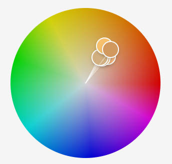
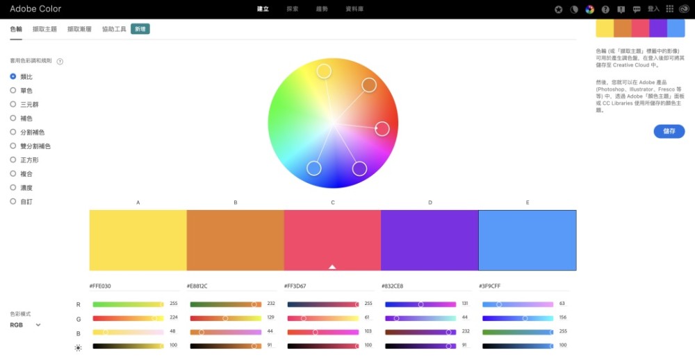
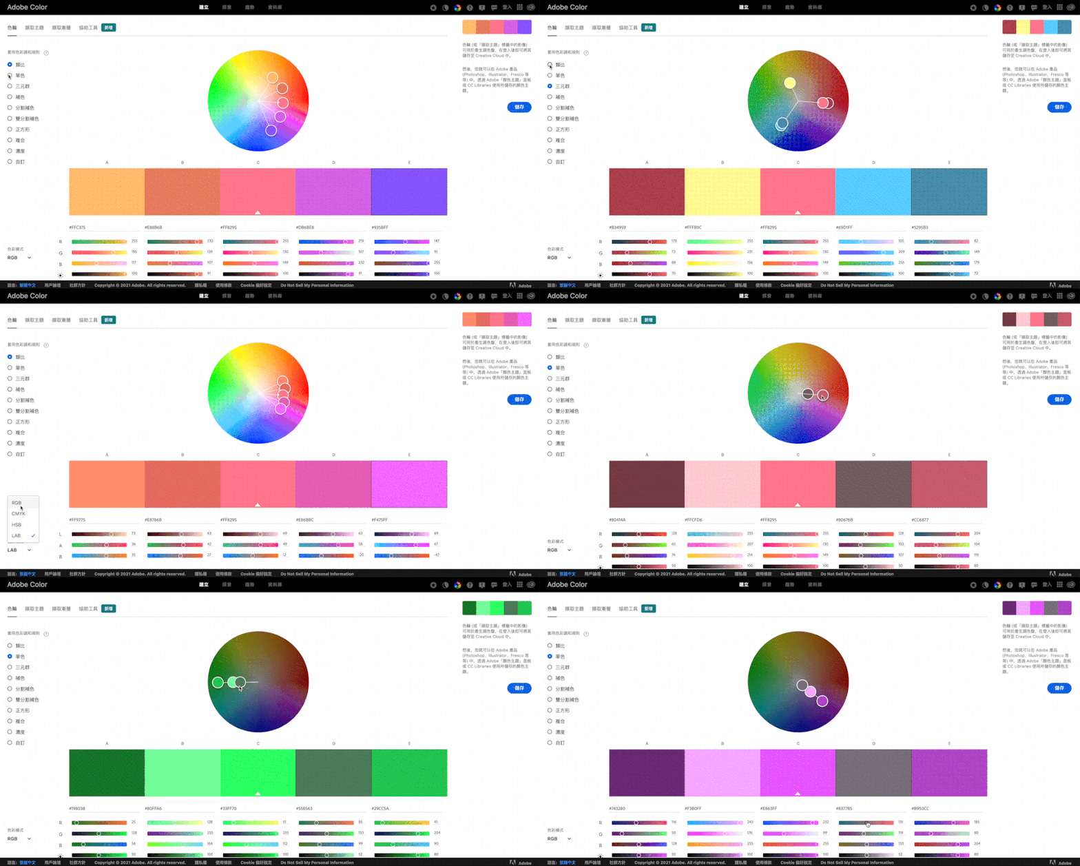
Adobe Color has an incredibly powerful color matching mode, offering a total of 9 intelligent color adjustment modes to choose from. You can click on the left side to operate based on how you want to adjust the colors. The color mode also supports 4 types: RGB, CMYK, HSB, LAB.
For example, if you want to use a monochromatic scheme, you can directly select the monochromatic button to make adjustments. When adjusting, it will automatically harmonize your color values, as shown below:
Second Major Section: Extract Theme Feature
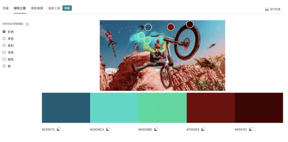
You can directly upload images from your computer for color extraction. After uploading, you can also select the desired color context: Colorful, Two-Color, Soft, Dark, Deep — it's incredibly thoughtful!
Third Major Section: Gradients
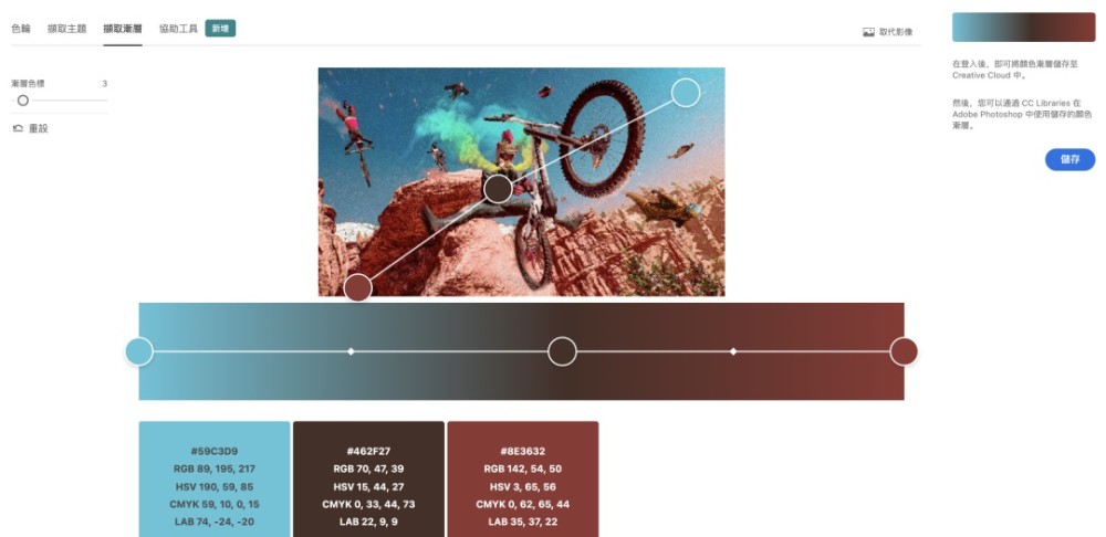
You can extract the gradient colors from uploaded images, and the extracted gradient colors look very sophisticated. It's a huge blessing for those who don't know how to create gradients, after all, many designers' gradients tend to look a bit "muddy." With the buttons on the left, we can also select 2-15 gradient points — it's simply amazing.
Fourth Major Section: Accessibility Tools
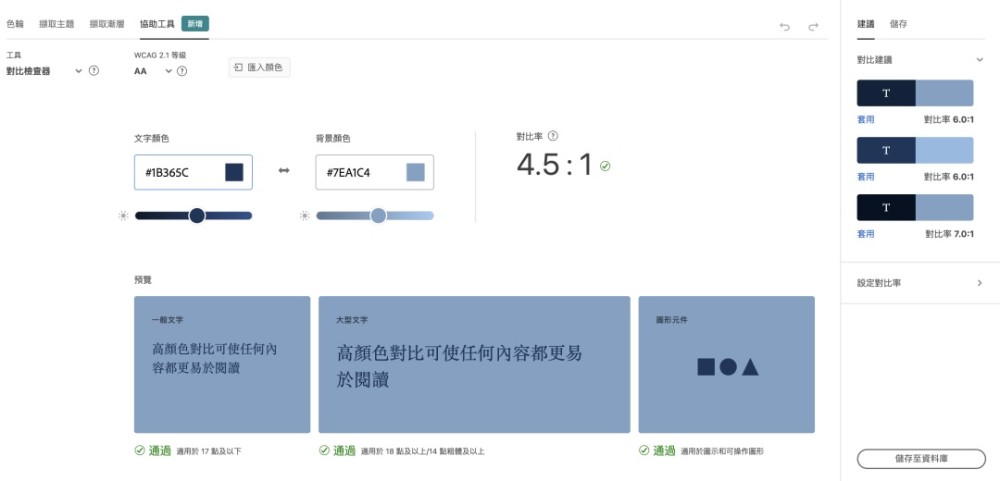
It can reasonably help you check the contrast between 2 colors. The preview can tell you under what circumstances you can use colors this way. Of course, on the right side, it will also give you color suggestions. You can also set the contrast ratio yourself to adjust the colors, so your colors will never look muddy and cheap again!
Contrast Ratio Recommendation: The MD specification states that text should maintain a contrast ratio of at least 4.5:1 (calculated based on brightness values) to maintain text clarity; the optimal contrast ratio is 7:1.
Fifth Major Section: Explore & Trends
Click on Explore to browse some high-quality images, and you can also extract color palettes from them. Click on Trends to even browse the color schemes used in design works from different design fields on Behance. Following the color matching of awesome masters will never be wrong, keeping up with trending color schemes in real-time — it's absolutely fantastic!!!
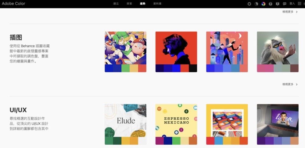
Of course, we can also search to quickly find the images and colors we want. I personally really enjoy using it to find mood boards — not only are the colors clear at a glance, but the images are also very high-quality!
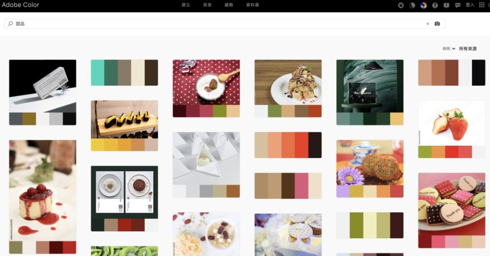
Overall, this website not only solves our color matching needs from every dimension, but also addresses many of my image-finding needs — it's truly a win-win.